There is something about the mythos of a record label.
Iconic organizations like Atlantic and Def Jam are akin to museums and have played host to the biggest names, songs, and albums music will ever know.
Perhaps it’s to do with the music industry as we know it. It’s an exciting and mysterious world that involves the most creative minds of a generation. And these artistic people must find a way to monetize their unique creations.
Which brings us to the fabled studio magic… where transcendently timeless songs are put together. Not just plain old songs – but musical masterpieces that shape the social consciousness and cultural zeitgeist. Oh yeah, and these recordings also earn millions of dollars for the studio and musicians alike.
Music studios help bring a musician’s vision to life with a deft mix of technical proficiency, artistic nuance, and business acumen. And as such, are an overwhelmingly powerful entity. It’s not just world-famous conglomerates like Warner Brothers or Sony that can make an impact. Independent Labels are one of the most crucial components of the industry.
There’s one thing you’ll notice about most successful labels, however, whether independent or major. It’s that, for the most part, they care deeply about their image.
Thereby making physical appearances a surprisingly invaluable facet of an industry that’s auditory by nature.
Profitable labels pay attention to the visual aspect of their business as much as what they’re hearing. Many artists possess distinct looks and dress a specific way to establish a motif. How musicians look on an album’s cover matters almost just as much as the album’s songs. And when a look cohesively jives with the sound, there’s a thematic harmony that’s conducive to art in its highest form.
If you own a record label, you know full-well that the competition is fierce. To survive and thrive in the industry, you must apply the above principle to your own brand image.
This outlook starts with your logo, which – in most cases – is the first impression people will have of your studio.
In a nutshell, your logo is your identity as a music recording company. A striking design that attracts the eye will boost sales on appearance alone. On top of that, an increase of talented artists who connect with your overall vibe (further enhanced by your visual motif) will take notice as your record sales increase.
Below, I’ll examine further why a logo can contribute so prominently to your label’s overall success.
Books, Food, and Other Metaphors
We all know the phrase, ‘don’t judge a book by its cover.’
The reason why people are so insistent about using the above phrase is that it’s just human nature to judge everything, initially, by its appearance. We try to go beyond how things look, yet can’t help but succumb to our base instincts.
Think about it, the brain can see images that last for just 13 milliseconds, so it only makes sense that humans would be biased towards visual stimuli.
To add on another visual-related cliché, humans also eat first with their eyes. Meaning, that how something looks (in this case, food) has a psychological effect on our overall perception of the object.
Okay, maybe humans don’t eat music. Though I’ve heard someone who visited their share of Grateful Dead Concerts tell me he could taste each note. But that’s a different story altogether.
Furthermore, your recording studio might boast some of the most state-of-the-art equipment in the world. You might be the next coming of Mozart, and Quincy Jones combines as a producer and composer. Still, if your label design fails to strike some form of a visual cord, your record sales will likely end up a touch flat—at best. Plus, top talent won’t be clamouring to sign the dotted line if your logo is anyway off-key.
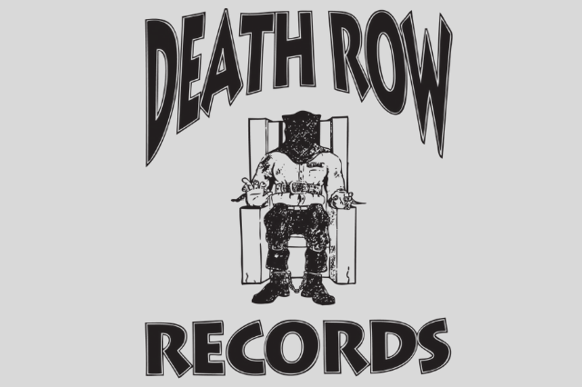
Take Death Row Records, for example. Do you think bubble letters and gentle imagery would have attracted its roster of edgy hip hop talent as well as millions of rebellious teens?
Would Atlantic have ever recorded Zeppelin, Wiz Khalifa, or Bruno Mars if it didn’t give off bluesy R & B vibes with its logo?
Then, what of more corporate studios like Warner Brothers and Sony? The cleanness and precision of those logos establish professionalism sought after by many musicians.
But let’s break it down to its barest elements and eliminate factors such as brand identity and demographics. If your logo resembles the work of someone in their first week of photoshop lessons, what self-respecting artist will want it disgracing their album?
Learning from the Masters
Now, it’s time to learn from the example of some of the top label logos in the music industry:
DFA: When Lightning Strikes
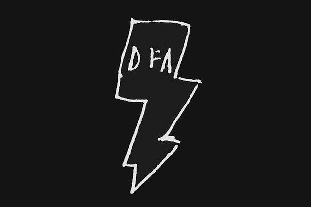
New York dance-punk and the DFA lightning bolt are symbiotically connected. It’s this unique relationship that symbolizes a time and New York City that was encapsulated by monstrous beats and massive electronic sound.
The label was responsible for albums artists such as Rapture, Cut Copy, and LCD Soundsystem.
DFA’s punk aesthetic is perfectly captured with the stick and poke tattoo appearance of the lightning bolt. The idea behind the execution was to add a human element—so it didn’t seem like it came from a machine (a corporate machine, one could safely assume).
This appreciation of ragged imperfections is what dance pop-punk was all about. It’s a subtle-yet-powerful touch in the logo that made both fans and artists of the genre lean towards the label. Such a self-aware logo showed the company had their finger on the pulse of its audience.

Death Row Records: Truth in a Name
Yes, we’ve brought up Death Row already—but it’s always worth taking another gander at the equally famed and infamous music recording company. To be honest, the history of Death Row could make for an Oscar-Winning true crime movie.
It’s that air of mystery, scandal, and violence that makes the record label so alluring. Of course, big boss Suge Knight’s shady past and present add as much to Death Row’s story as anything else.
There’s an air of criminal authenticity in Death Row’s abrasively jagged electric chair design, complemented by the aggressively stark colours. Audiences generally are drawn to authentic designs that speak their truth.

Alternative Tentacles: Nocturnally Inclined Design
Winston Smith was the collage artist whose most revered piece of work was the Alternative Tentacles logo.
In 1979, the Kennedys recorded a self-produced single called California Über Alles under the Alternative Tentacles name. It grew to attract some of the most successful acts in the American alternative and punk scenes, such as Butthole Surfers and DOA.
What I appreciate most about the bat symbol is its establishment of a “creatures of the night” vibe. Those partaking in an alternative lifestyle who’d write this music, listen to it, or do both would immediately identify with the bat symbolism and dark colour motif.


Apple Records: The Fruit of Quality Design
Gene Mahon is the mind behind the corporate logo design for the Beatles’ multimedia company, Apple Records.
The approach is minimalist, yet entirely outside-of-the-box and creative just the same. It’s a bright green Granny Smith apple—and albums would feature the common fruit whole on it’s A-side. Then, in a clever twist, the B-side would be featured with the apple cut in half.
The logo itself was straightforward. Yet, it interacts with the content on the album cover in a way that’s both genius and thoughtful.


Differentiating Your Brand from the Pack
The music industry is harsh—especially when you’re starting as a label and working hard to catch a big break. Alternatively, even if you’re an established label, it’s not like the competition disappears at any point.
But let’s examine newer, smaller, and independent labels for a moment, before going any further.
You might have a relatively bare-bones operation and, therefore, zero marketing clout throughout the industry. Yes, you have the channels available that everyone else does; social media, word of mouth, and perhaps you can send around flyers. However, even these marketing methods become less impactful without piles of money to throw around.
That isn’t to say you can’t catch the eye of a lucrative audience. You just have less of a chance. So, when someone does happen to come across your studio’s label, why not ensure it’s an artistically crafted tour de force that refuses to be forgotten?
It’s Time to Invest in Your Music Company Logo
Big, small, medium, and minuscule music businesses alike always need to be hyper-conscious of their brand image if they plan on growing.
And in the music world, which is wildly artistic and imaginative, visual aesthetics are an integral part of the package.
Therefore, a record label’s logo is almost as crucial as its business model, mission, mantra, and musical proficiency.
I’d suggest going as far as to suggest that your logo should encapsulate all the elements mentioned above in one iconic image.
If you’re interested in finding a logo that sets your music company apart and strengthens its brand image, contact us today. You’ll be captivated once you’ve seen our portfolio of enticing designs.
